Redefining the radiology experience
Hologic is a medical technology company best known for developing and supplying diagnostic products, medical imaging systems, and surgical solutions with a strong focus on women’s health—including breast and cervical cancer screening, molecular diagnostics, and related technologies. The company’s products are used globally to help detect, diagnose, and treat health conditions, raising standards of care and improving patient outcomes.
Company
Big Tomorrow
Client
Hologic
Role
Lead product designer
01 CHALLENGE
Overloaded interfaces
Many radiology systems present too much information at once, with inconsistent hierarchy and visual clutter that distracts from the image. Navigating multiple menus, tools, and screens interrupts focus and adds friction to routine tasks. Radiologists often can’t easily save or reuse preferred hanging protocols, requiring repetitive setup for each case. Essential tools like measurements, annotations, and comparison views are hard to find or inconsistent across cases. The interface competes with the image rather than supporting it, making it harder to detect subtle abnormalities. Specialized diagnostic monitors can dramatically alter brightness and contrast, causing UI elements to appear too bright or washed out compared to standard screens.
88%
of radiologist departments struggle with hanging protocols
47%
of radiologist encounter hanging protocol issues daily
02 APPROACH
Understanding the process
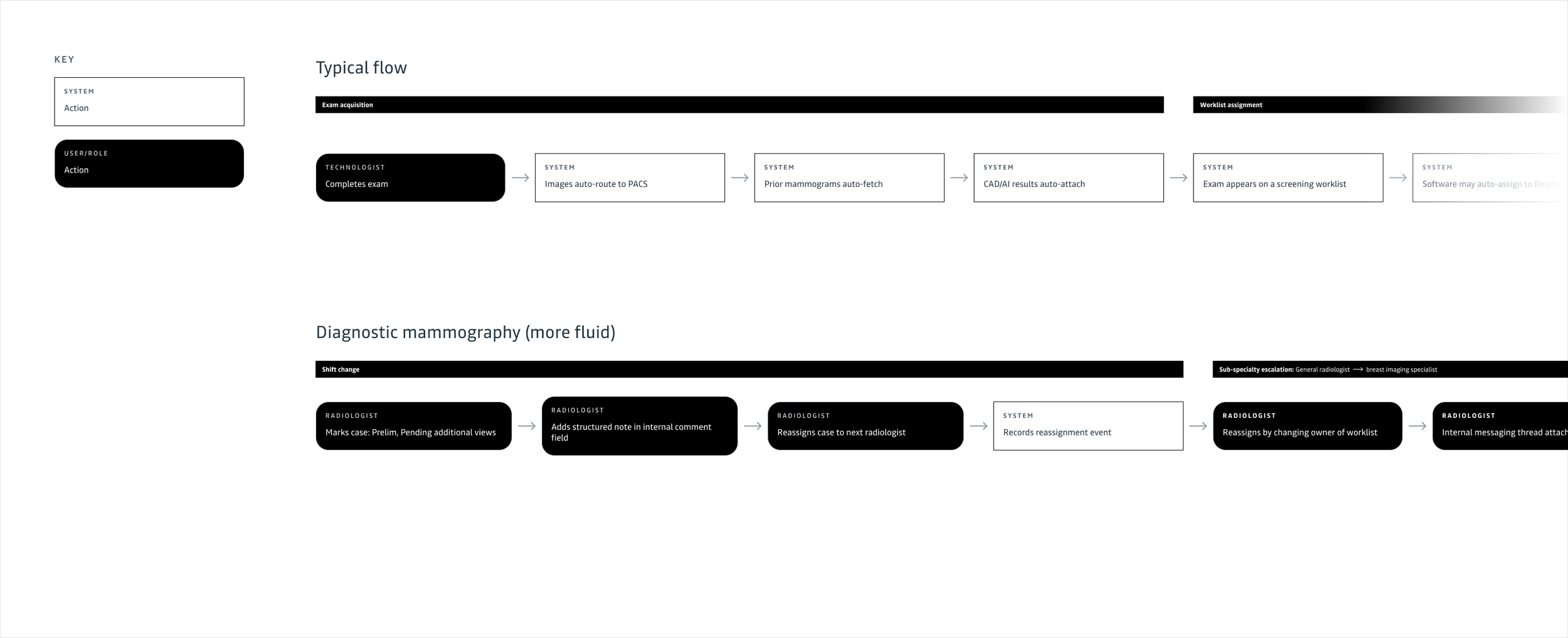
I began the project by mapping the end-to-end mammography workflow to ground my design decisions in real clinical practice. From exam acquisition and PACS ingestion, to worklist assignment, first read, shift handoff, second read, concordance check, and final report sign-off, I studied each step to understand responsibilities, dependencies, and friction points. This holistic view ensured the designs supported radiologists at every stage, improving continuity, reducing cognitive load, and strengthening diagnostic confidence throughout the entire lifecycle of a case.
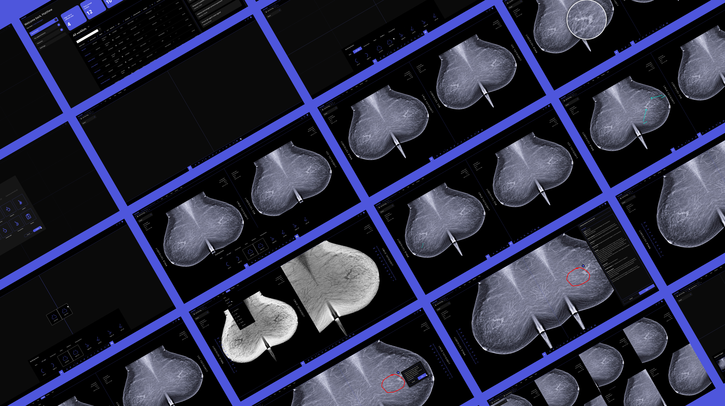
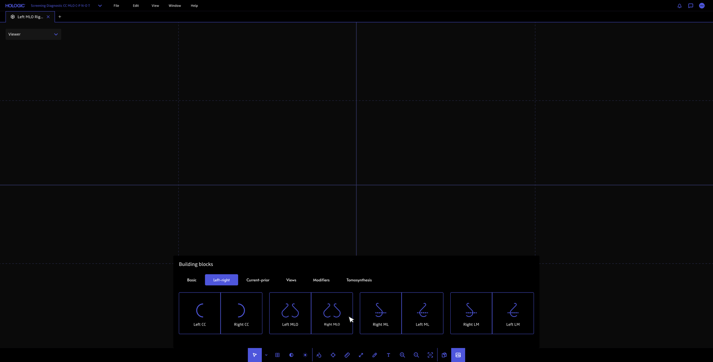
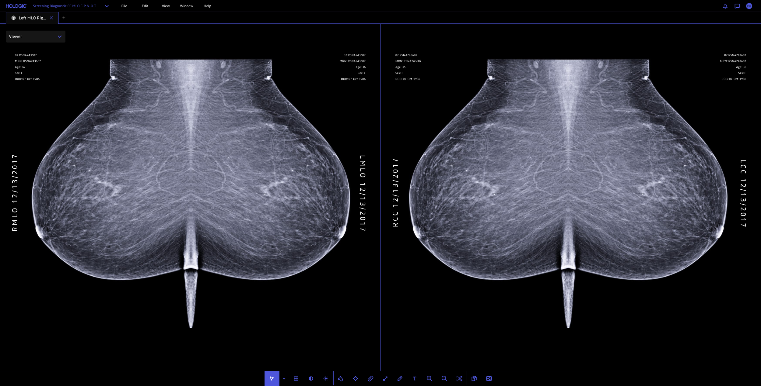
I began with a simple redesign of the hanging protocol flow, focusing primarily on a new grid system with drag-and-drop functionality. I then took the design and created a robust prototype that I could put in front of radiologists, observe their interactions, and get their feedback to inform my future iterations on the feature. This process revealed several key insights, including that many radiologists rely on specialized, high-luminance monitors calibrated to display the brightest possible whites—enhancing contrast and helping them detect subtle or potentially problematic masses in mammograms.
Additionally, radiologists tend to work in extremely dark environments. Due to this, I received a lot of feedback about the use of white being blindingly bright, leading me to pull back the use of pure white on screen and additionally focus efforts on having parts of the UI slightly fade and become more opaque on hover.
Mapping radiologist’s workflow and handoff processes
Improved hanging protocols
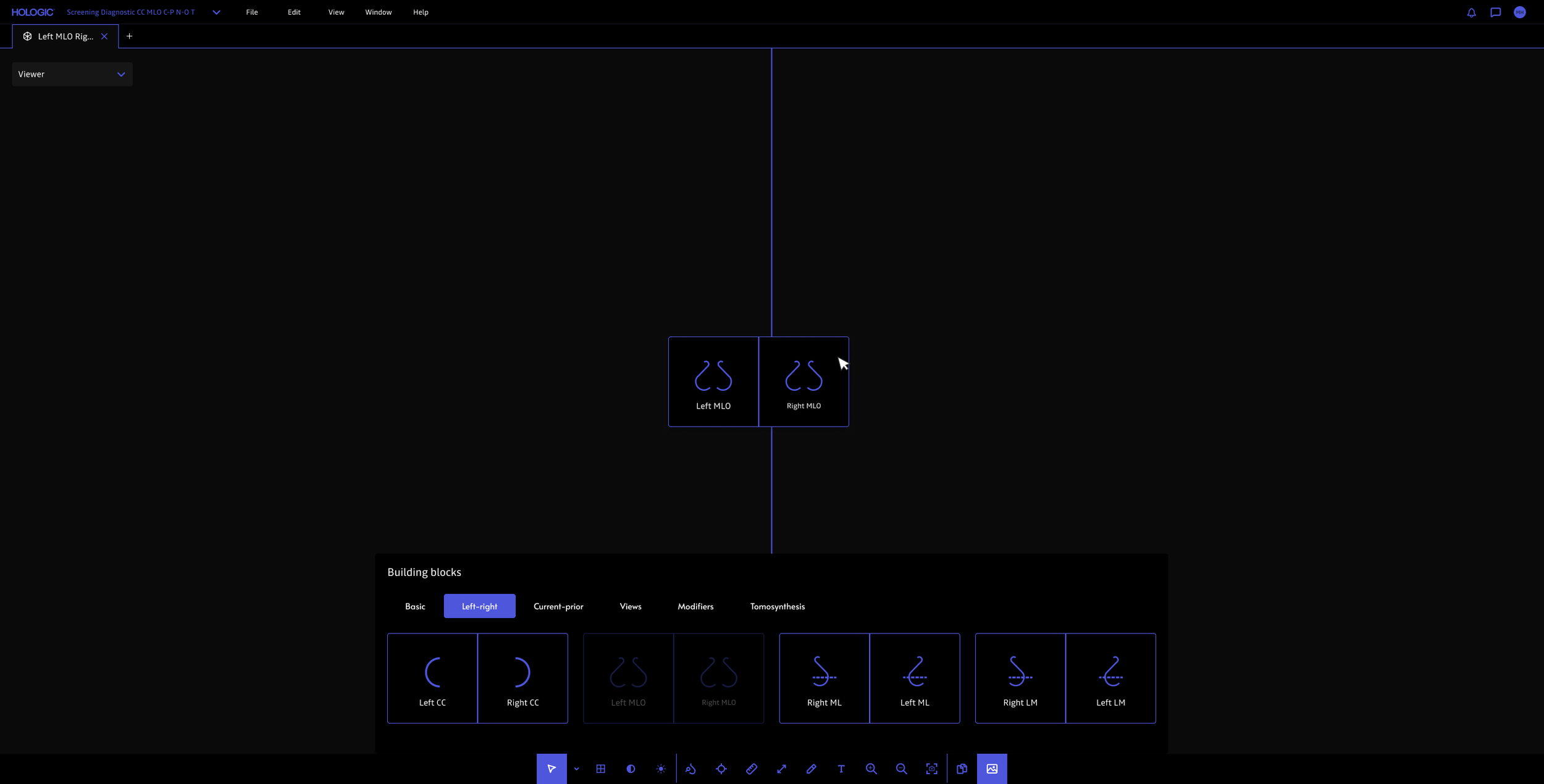
Before initiating a full-on design engagement, we started by focusing on one particular area of frustration which was setting up hanging protocols.
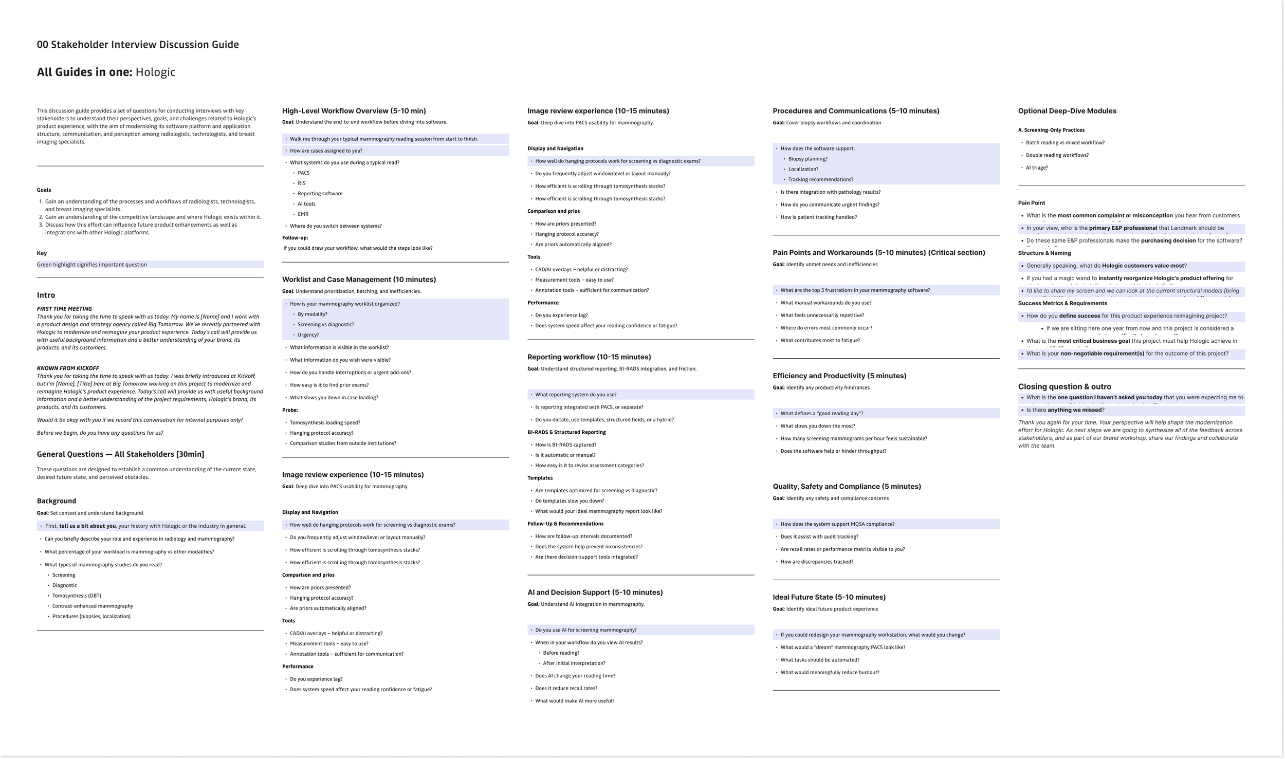
Interview guide
What I learned about radiologists, especially in mammography:
They need consistent multi-view layouts (e.g. CC / MLO / comparisons), but current software often requires manual re-arrangement.
Poor hanging protocols can had time to each case, ultimately leading to significant delays over a workload (e.. 50–100 cases/day)
Integration issues between PACS (Patient Archiving and Communication Systems), CAD / AI, and mammography viewers can force radiologists to break their reading flow, contributing to frustration and inefficiency.
The fewer clicks, the better
I reduced the number of clicks that are typically required for setting up hanging protocols as well as common actions such as zooming, panning, window/level, measure, annotating, etc.
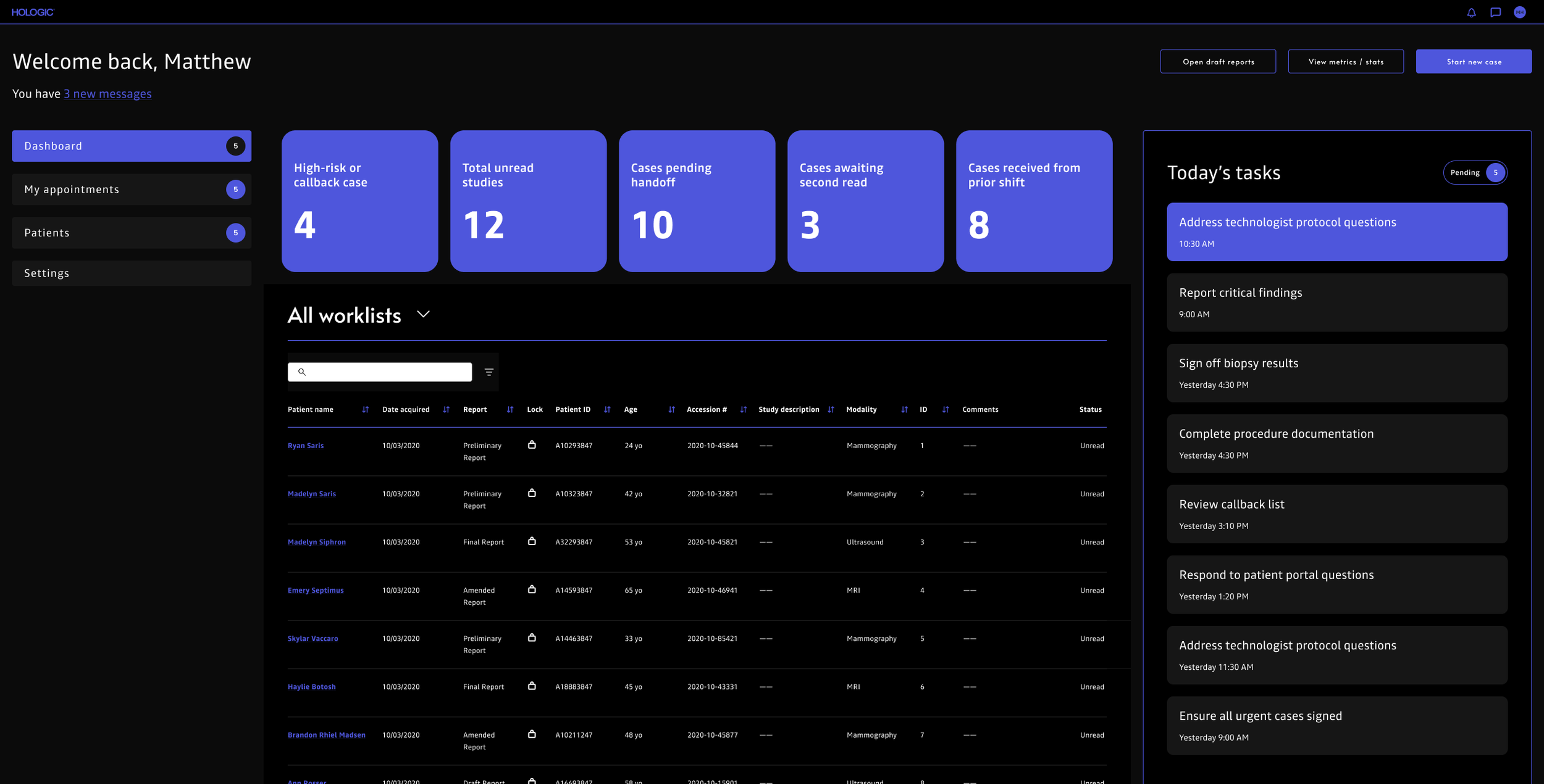
A redesigned dashboard
I designed a dashboard to give radiologists clearer control over their daily workflow. The new experience improves worklist filtering and sorting, highlights priority studies, surfaces daily tasks, and supports seamless handoffs between radiologists, technologists, and breast imaging specialists. By reducing friction and improving visibility into workload status, the dashboard helps radiologists stay organized, focus on high-impact cases, and move through their day with greater efficiency and confidence.
Clearer iconography
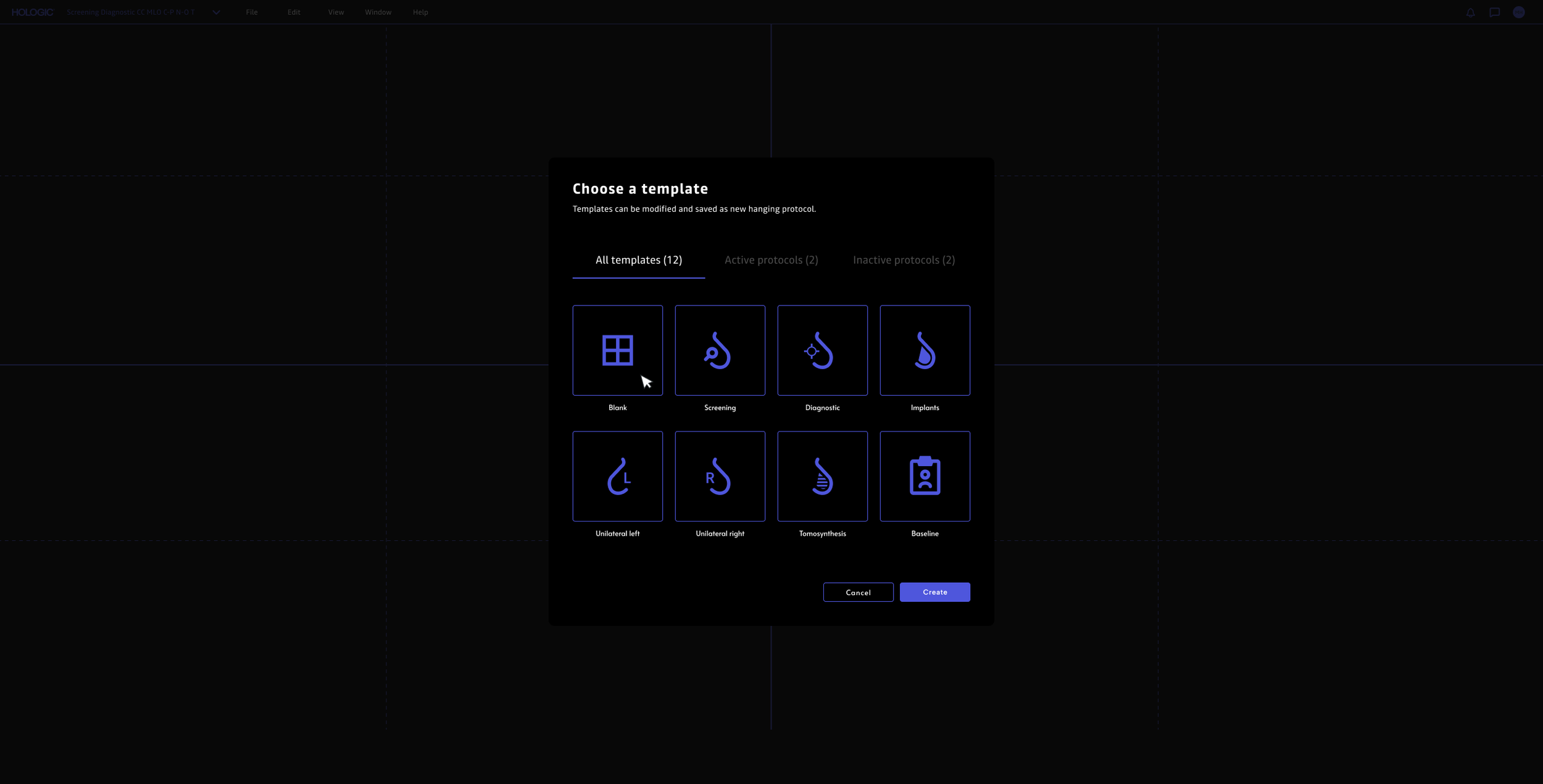
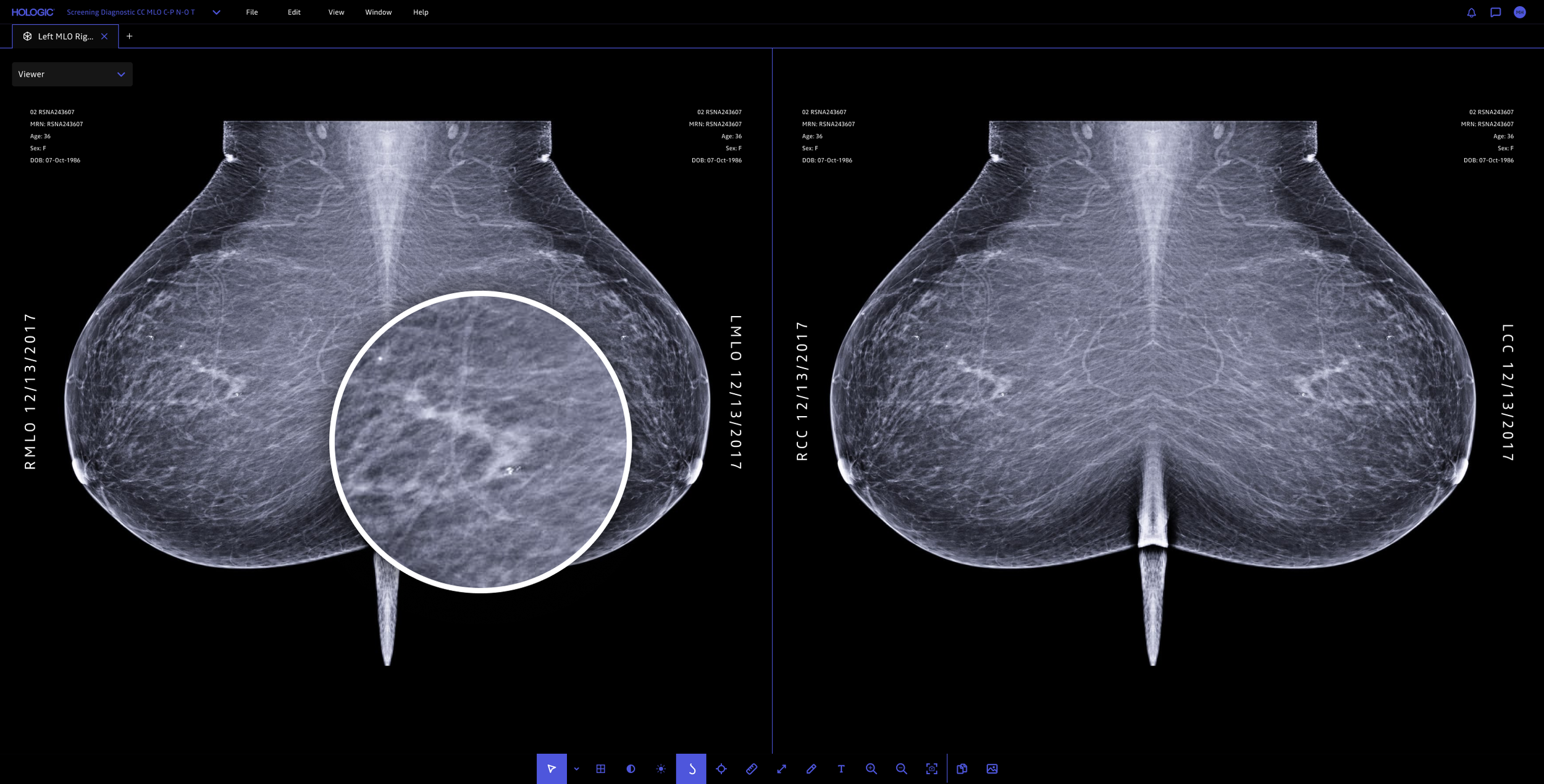
I simplified mammography view and angle icons by removing visual clutter and standardizing shapes, stroke weights, and orientation cues. After auditing legacy icons and observing radiology workflows, I simplified complex positioning (e.g. CC and MLO views) into clear, minimal geometric forms that remained legible at small sizes. Through iterative testing, I ensured fast recognition, accessibility, and consistency within the radiology software.
Improved zoom and magnification functionality
More control of overlay visibility
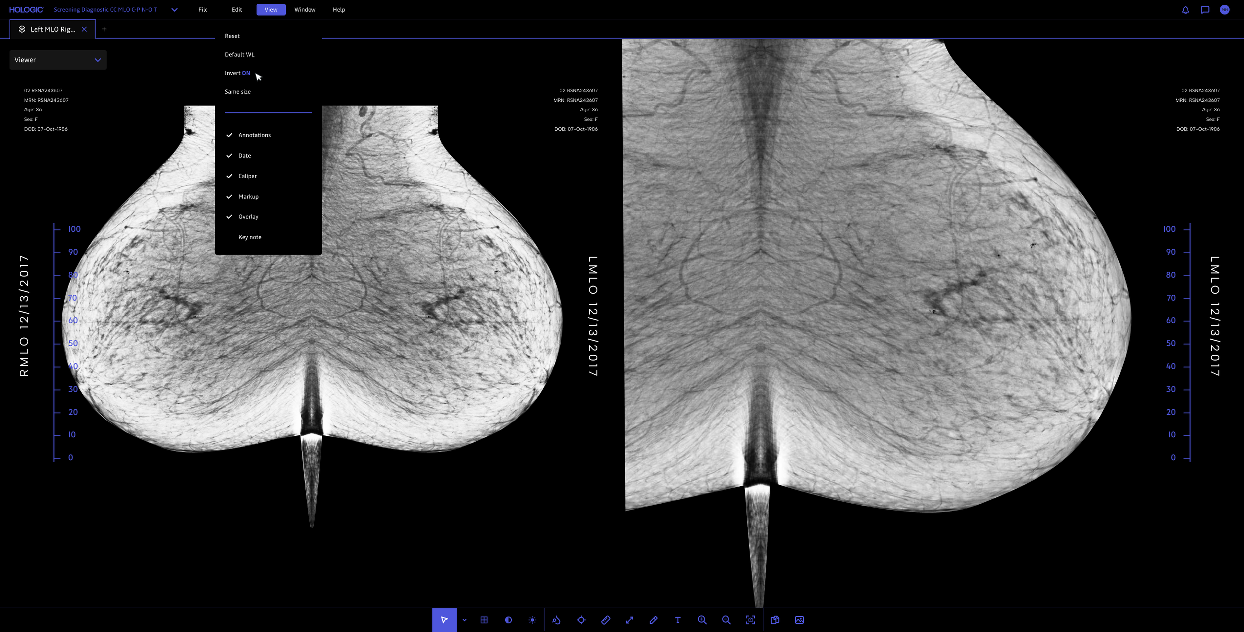
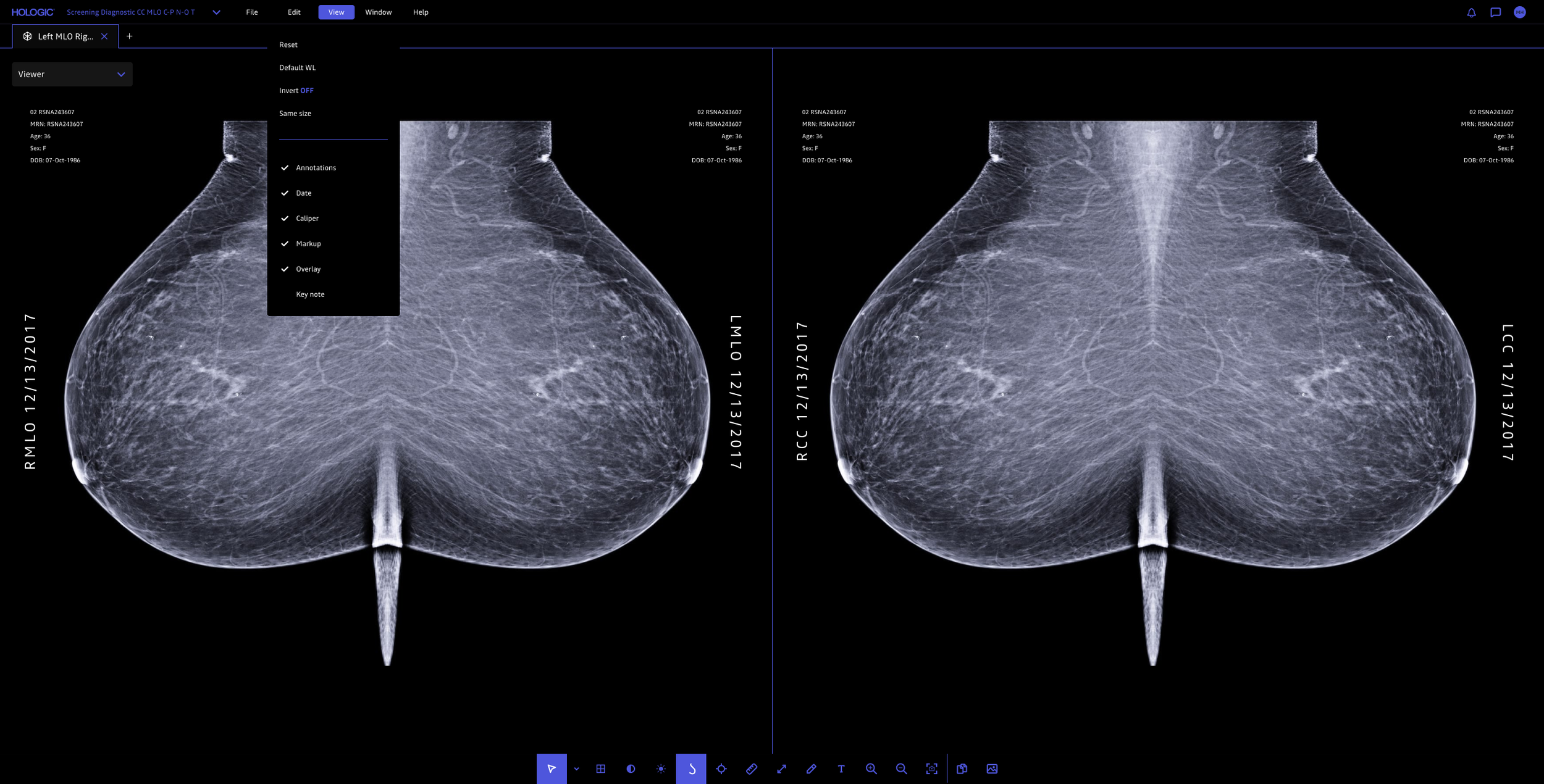
Better image inversion
Improved contrast control
I observed radiologists in their typical work environments, which are usually very dark. Their primary focus is identifying potential masses in mammograms that may indicate cancer, so they need those areas to stand out as the brightest elements on the screen. To reduce visual distractions, I designed the interface to dim the surrounding elements while keeping the image and potential findings prominent.
During testing, I also discovered that many radiologists use specialized diagnostic monitors that maximize brightness. As a result, even though I avoided pure white in my designs, the displays rendered the interface much brighter than intended, appearing dim on my MacBook screen, but extremely bright in the clinical environment. I was able to obtain one of these specialized, extremely costly monitors so I could continuously test my designs to better tailor the experience to the needs of the radiologists.
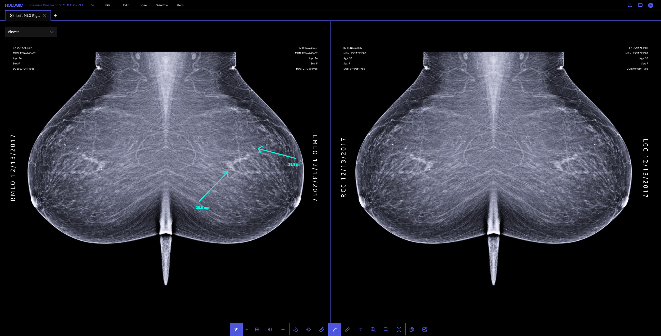
Improved drawing and measuring capabilities
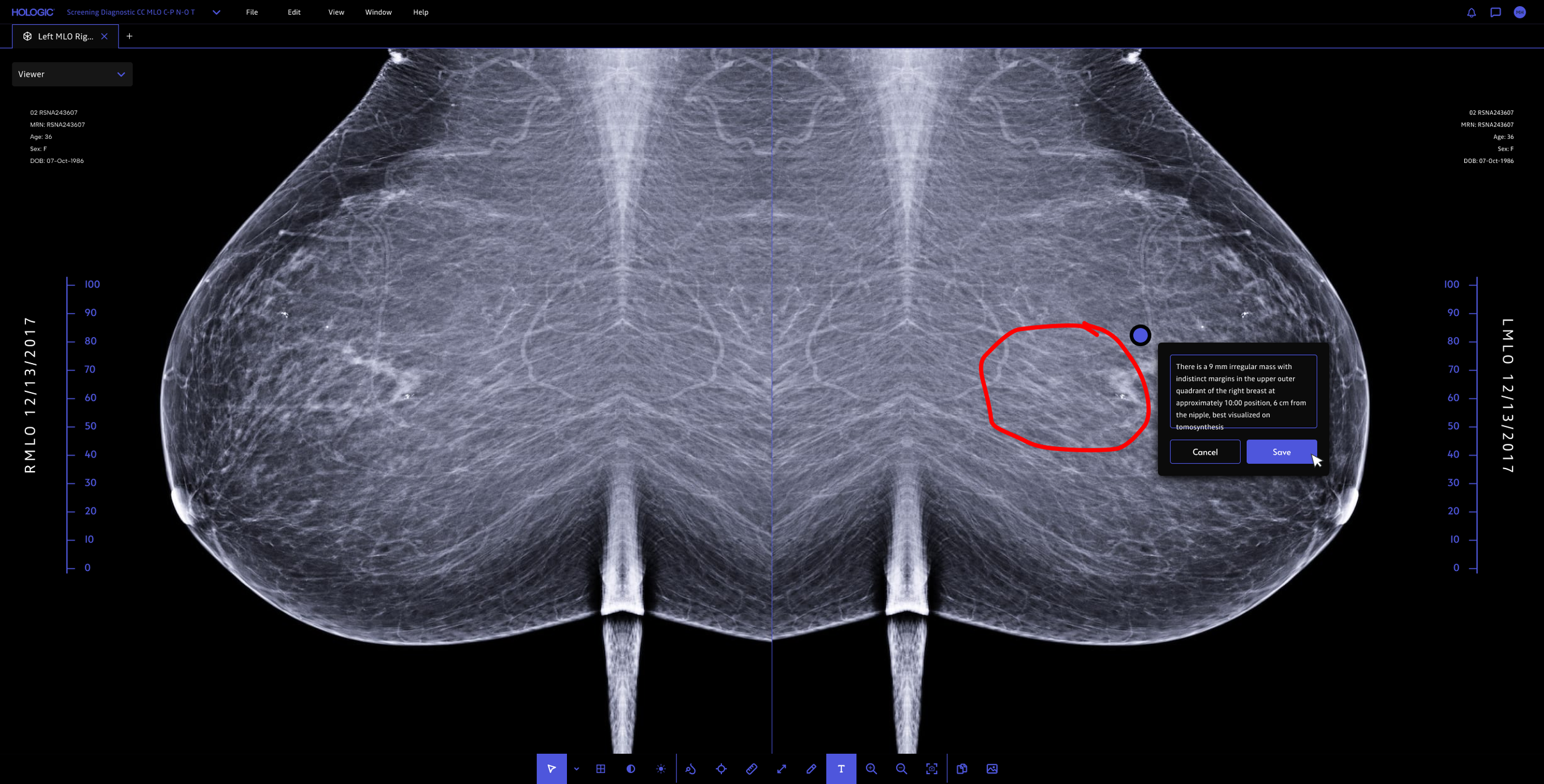
Better annotations for handoff
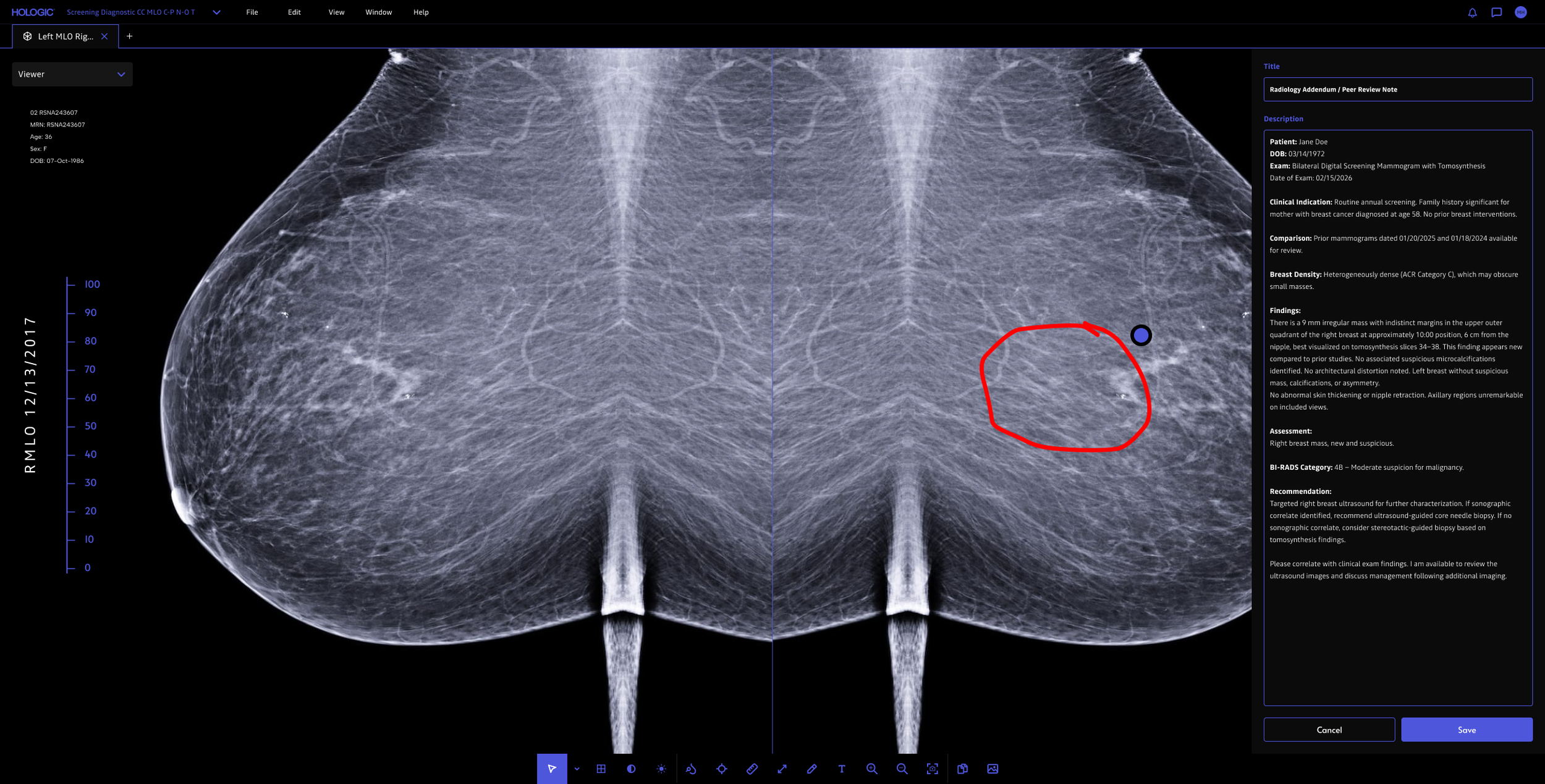
Report creation for handoff
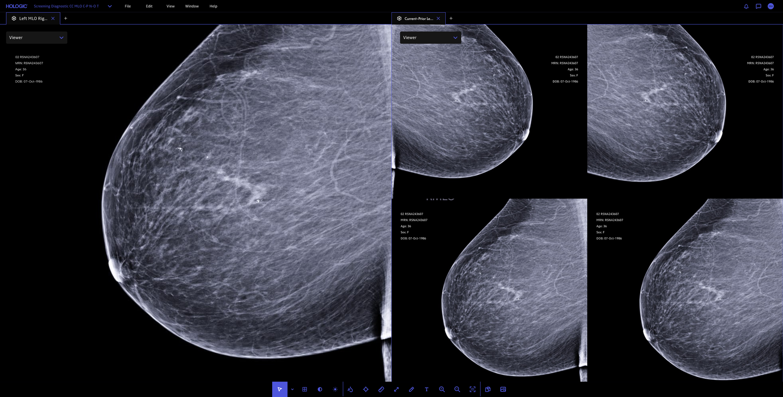
Multiple tabular functionality for comparing images
03 RESULT
The redesign and prototype was delivered to Hologic, but the project ended abruptly due to the agency I was working for shutting down. I don't have post-launch usage data, but the work clarified the hanging protocol problem enough that it shaped the next product roadmap
04 REFLECTION
What designing for radiology taught me
Designing for radiology changed how I think about interface craft. The most consequential decisions weren't the ones a reviewer would notice, but the ones a radiologist wouldn't: pure white pulled back, periphery dimmed during review, hanging protocols quietly reduced to a fraction of their clicks. I left this project convinced that the best clinical software gets out of the way, and that the highest form of craft is making the absence of friction feel like nothing at all.
If I could go back, the artifact I'd want is a year of radiologist read-time and diagnostic-confidence data to validate the dimming/contrast decisions. Those were some of the hardest calls and the ones I'm least sure landed.